In the zone. Feeling it. In the groove. Zeroed in. A state of flow.
We’ve all been there (hopefully) at some point in our lives. It’s almost magical. When it all comes together, and everything slides effortlessly from point A to point B. Athletes, writers, speakers, artists, chefs, doctors, musicians, teachers.
And users…if you’ve done your job properly.
The “flow” in this case is the free and easy path a user (i.e. your customer) takes on your website to do something: make a purchase, sign up, download, subscribe, or whatever. They also want it to be effortless.
Also known as the user journey, the flow must reflect their needs and their preferred route. Not yours. You have to put yourself in their shoes.
Flow Interrupted
Think about a time when a website felt clunky, confusing, or downright unfriendly. There you were trying to do something – get information, buy a product, download a case study – and you couldn’t get it done.
The link wasn’t where you expected it. They asked for details you felt were unnecessary. There was no form or button. It all felt counterintuitive.
That’s flow interrupted. It’s like slamming into a brick wall.
That business designed that page with themselves – not you – in mind. Big mistake. Why? Because you most likely bounced. Left. Bolted for greener pastures on a more user-friendly site.
Had they given any thought to user flow, they would have identified and removed those obstacles for you. Blown up that brick wall.
Instead, they’re left wondering why their conversion rate is so damn low.
The Modern Marketer
Your job is to get the right product in front of the right people at the right time. That product may be a physical object, or a service, or a lead magnet like an infographic, ebook, white paper, or email newsletter. Doesn’t matter.
We live in a multi-channel marketing ecosphere. There’s analog (the real world: billboards, flyers, radio and television spots, direct mail) and digital (everything online: organic search, PPC, social media, email). Much of your analog and all of your digital efforts are probably aimed at getting them to your virtual porch.
When they do arrive at your site, how often are they ready to commit (buy or sign up)? If you answered “rarely”, ten points for Gryffindor.
You need to get them through the door and guide them down the corridor to the sale. But here’s the catch: there’s more than one door.
User flows allow you to give them everything they need to make it down their corridor without hitting any walls or dead ends.
To get started, you need to identify their entry point.
Step 1 – The Many Doors of Arrival
Think about a house. If you were giving directions to someone entering a huge mansion on how to find your study (you live in a palatial estate in this example, just because), a lot would hinge on where they come in, right?
Front door. Back door. Sliding door in the media room. Cellar window. Through the vents. It makes a difference.
The same is true for visitors to your website. Users can arrive via a number of different avenues:
- Organic search
- PPC
- Social Media
- Direct Link
- Referral Link
Depending on their point of entry, they’ll have different wants, needs, and goals. Once you determine the door, you next need to consider the objective.
Step 2 – The Point of it All
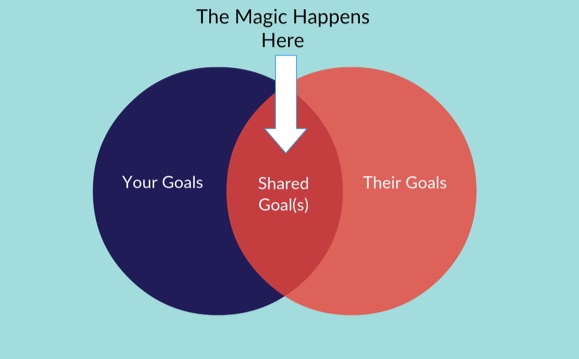
You have goals. And so do your visitors. Sometimes they align perfectly, and sometimes you need to find the common ground between them. The trick is to not let your objective take precedence over theirs.
Typically, a business goal is to get the sale, or get the contact details, or get someone to sign up for something.
Think about what you want them to do, of course, but also consider what they want. The user goals are an equal member in this partnership. You want the sale. They want a solution to a problem or to fill a need or desire they have.
That is, eventually they want a solution or to fill a need. Depending on how they arrive, their immediate needs may be very different. Each channel gives you hints as to their intentions, their familiarity with your brand, and what they’re after on this visit.
The Direct Route
A user arriving via a direct link – either entering your URL into their browser, or clicking on a bookmark – is usually after whatever it is you’re selling. They know you already, they probably purchased in the past, and they’re looking for more. Perfect.
Your goal – make a sale – and their goal – make a purchase – are in total agreement. Your user flow here might be a simple homepage > product page > cart > confirm > thank you.
To knock down walls for them, you need to ensure your homepage has clear and visible links to your product and/or category pages, that each product page has an obvious “Add to Cart” button, and that your checkout procedure is fast, easy, and frictionless.
But what about someone coming in the organic door?
The Organic Route
They don’t know you. They may be on a fact finding mission. They may (and probably do) have tons of questions, concerns, and reservations. You’re just one SERP link of many.
Using the direct user flow here would be disastrous. They’re not ready for that.
Their door from the SERP may have them arrive on your homepage, or a special landing page. But then what? What do they want and need most at this stage?
Your ultimate goal stays the same: make the sale. But their goal is quite different in this flow. They want info. Answers. Evidence.
In order to get the conversion down the line, your goal and their goal must intersect, so your objective at this point should be to wipe out any hesitation they may have about you and your brand.
Include clear details about yourself, links to your About and Contact page, FAQs, social proof in the sidebar, and more. Put yourself in their shoes. What do they need to feel better about doing business with you?
The organic user flow might be SERP link > special welcome page > email subscription, or SERP > homepage > about > blog > contact form.
Knock down walls. Keep them moving forward.
PPC door? They want more information of that particular product or service, and a quick way to purchase it. Referral link door? They likely want at least a bit more background on you and your company.
Each arrival channel has its own set of unique wants, needs, and typical objectives. How do you find them?
Step 3 – Ask and Ye Shall Receive
You ask questions. Lots of them.
Think about visitors arriving from each avenue and ask yourself:
- What needs, wants, desires, or pain points do they have? Why?
- What are they most looking for in a solution? What features matter most to them?
- What questions might they have about the product or service? What hesitation or concern might they have? What separates you from the competition?
- What do they need to propel them to action?
- What is the emotion driving them?
To find the concrete details, look to your existing customers. Ask them, interview them, survey them. Get the information, then craft user flows that deliver what they need at the right moment. That’s the only way to successfully nudge visitors down each hallway.
The trick is to close the gaps, the missing information, at exactly the moment when they need it, and to avoid throwing anything else at them. Too much is as bad as too little.
Be clear, highlight benefits over features, offer evidence to support your claims and value props, and make it easy. Ridiculously easy. Each step should naturally guide them to the next one.
Step 4 – Put it All Together
You’ve got the entry point, their immediate objective, and answers to their most pressing questions and needs. Time to get creative.
Document each user flow so you can see it from start to finish.
- Pen/Markers and Paper (it’s a classic)
- Whiteboard
- Corkboard and Post-Its
- Programs like UXPin, Slickplan, Lucidchart, Lovely Charts, Mindjet, or any other flowchart/mind map software
A user flow consists of individual pages where something takes place (they click a link, or submit a form, or download, or add to cart, or whatever).
On every page, at every stage, they see and do something. It’s your job to determine what they need to see in order to get them to take the necessary action. A page may have more than one “next step”, and each one should be mapped out. Focus on the user, their needs, and how they may react to every step.
State Diagrams
You could sketch each step using state diagrams. These represent each page with two simple details: what the user sees (above the line), and what the user does (below the line).
State diagrams boil it down to its essence, and make a streamlined flow for any user arriving via any door. As a marketer, your task is to make the “sees” as dynamic, engaging, and convincing as possible to get the user to “do”.
Ask the questions. Find the answers. Guide them.
Stacked Flows
Basic user flows don’t automatically get you to the end goal: the sale. To do that, you may have to start stacking flows on top of each other.
A user arriving via an infographic you shared on Facebook may have a social media > landing page > email subscription flow. Nothing wrong with that…but the number of people on your email list doesn’t pay the bills.
So stack that flow. Once you have someone’s details and (more importantly) permission to contact by email, they enter a second flow beneath that one:
Receives email > visits promotion landing page > purchase.
The stacked flow here includes the social media acquisition flow, and the nurture flow. Together, they keep the user goal in mind at all times, but eventually leads them to your main goals…the sale, business growth, and more revenue.
User flows are tiered. The first layer may get them to sign up or share their contact details, which brings them to the second layer, where you hope to make a sale. That’s stacked flows at work, and it allows for your goal and their goal to intersect as needed.

Did you know? With Kissmetrics, you can track the effectiveness of your online advertising. Optimize your marketing by knowing which campaigns perform and which don’t. Check out our infographic to learn more.
Monitor and Manage
Once you’ve created and implemented a user flow, you can work to optimize it with A/B testing (using a tool like Optimizely) and/or real user feedback (get people to try your website while you literally watch over their shoulder…does it work for them? Does it seem intuitive? A service like UserTesting can connect you with testers if you don’t have anyone you can ask).
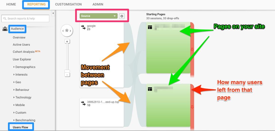
Google Analytics provides a visual Users Flow report under Audience on the Reporting tab. It provides visitor data – by source, country, language, behavior, advertising, social, and more – and how they navigated through your site.
The green boxes are pages on your site, the curved grey lines are the movement between them, and the red lines shows how many users left from that page. The first column will change depending on your selected option (this screenshot is using Source).
Discover exactly how visitors are interacting with your site, and whether they’re hitting dead ends or unnecessary roadblocks. Blow up those walls.
Identify bottlenecks, pages with high exits rates, and pages that should be directly linked based on user behavior. What do the flows tell you? What do users want that you’re not currently providing?
Compare the actual flows that exist with your documented user flows. Do they correspond? Let your users guide you on this.
Documenting user flows can help you build a website that works for all visitors, regardless on which door they come in. It puts you in the mind of your customers, blowing up walls and creating the clear pathways they want to follow. Get them from Point A – arrival – to Point B – conversion – by proactively giving them what they need when they need it.
Use flows for onboarding, navigation, design, and virtually every other decision about your onsite marketing. They’re the ones walking down the corridor.
What do they want/need at each stage? What do you need them to do? How can you gently nudge them that way? Answer those questions, and you’re primed for success. A straightforward, frictionless user flow means satisfied users, more conversions, and a bigger bottom line.
Have you documented your user flows? What tips, tricks, and tools did you use? Leave your comments below.
About the Author: Aaron Agius is an experienced search, content and social marketer. He has worked with some of the world’s largest and most recognized brands to build their online presence. See more from Aaron at Louder Online, their Blog, Facebook, Twitter, Google+ and LinkedIn.


Responses